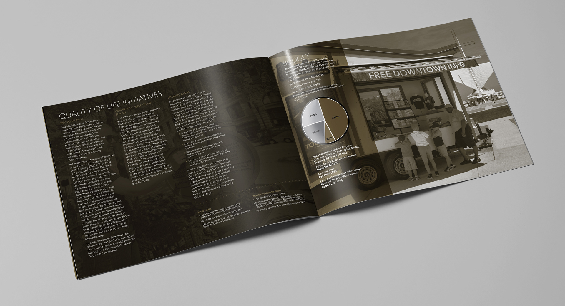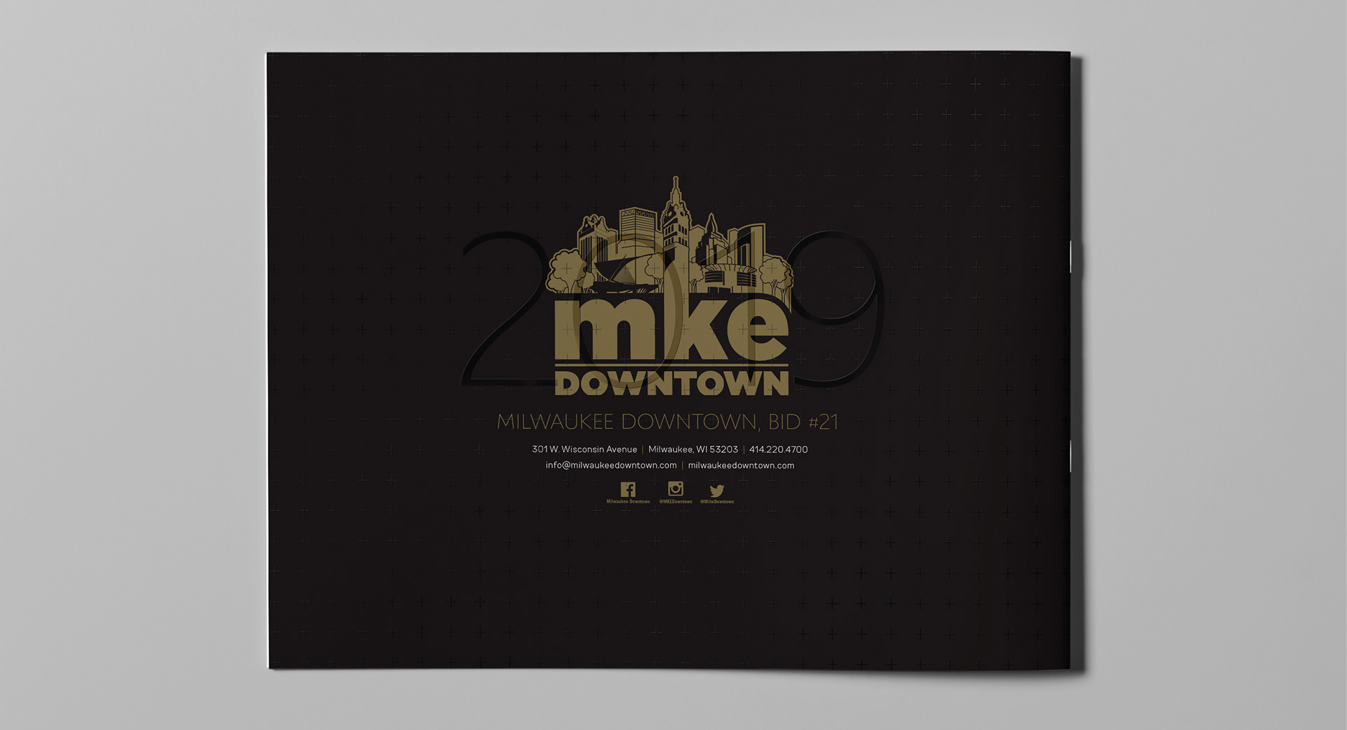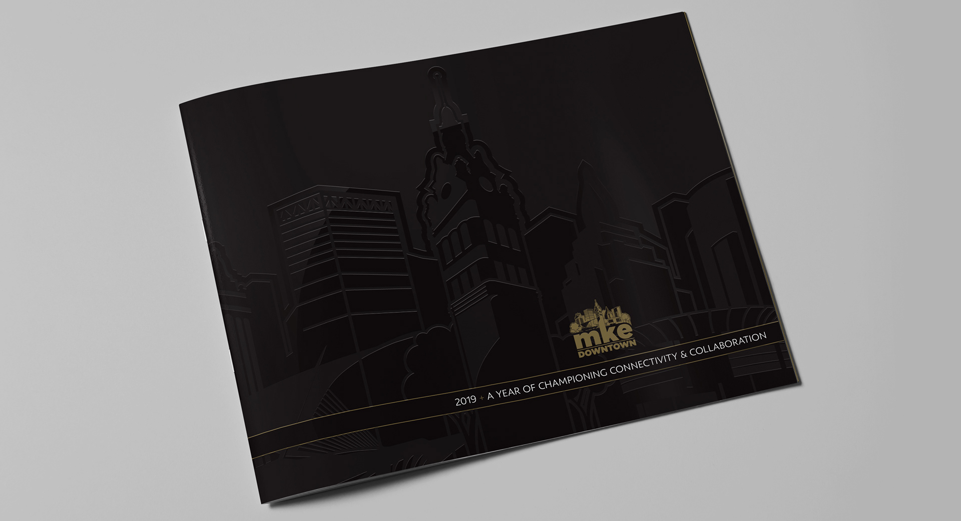
The piece was designed using black and metallic gold inks with a clear, shiny varnish to highlight important elements on the pages. The combination of the shimmer from the gold ink and the shine from the occasional varnish worked together to create a report that caused people to analyze the pages closer, constantly tilting and turning the pages to see the nuances.
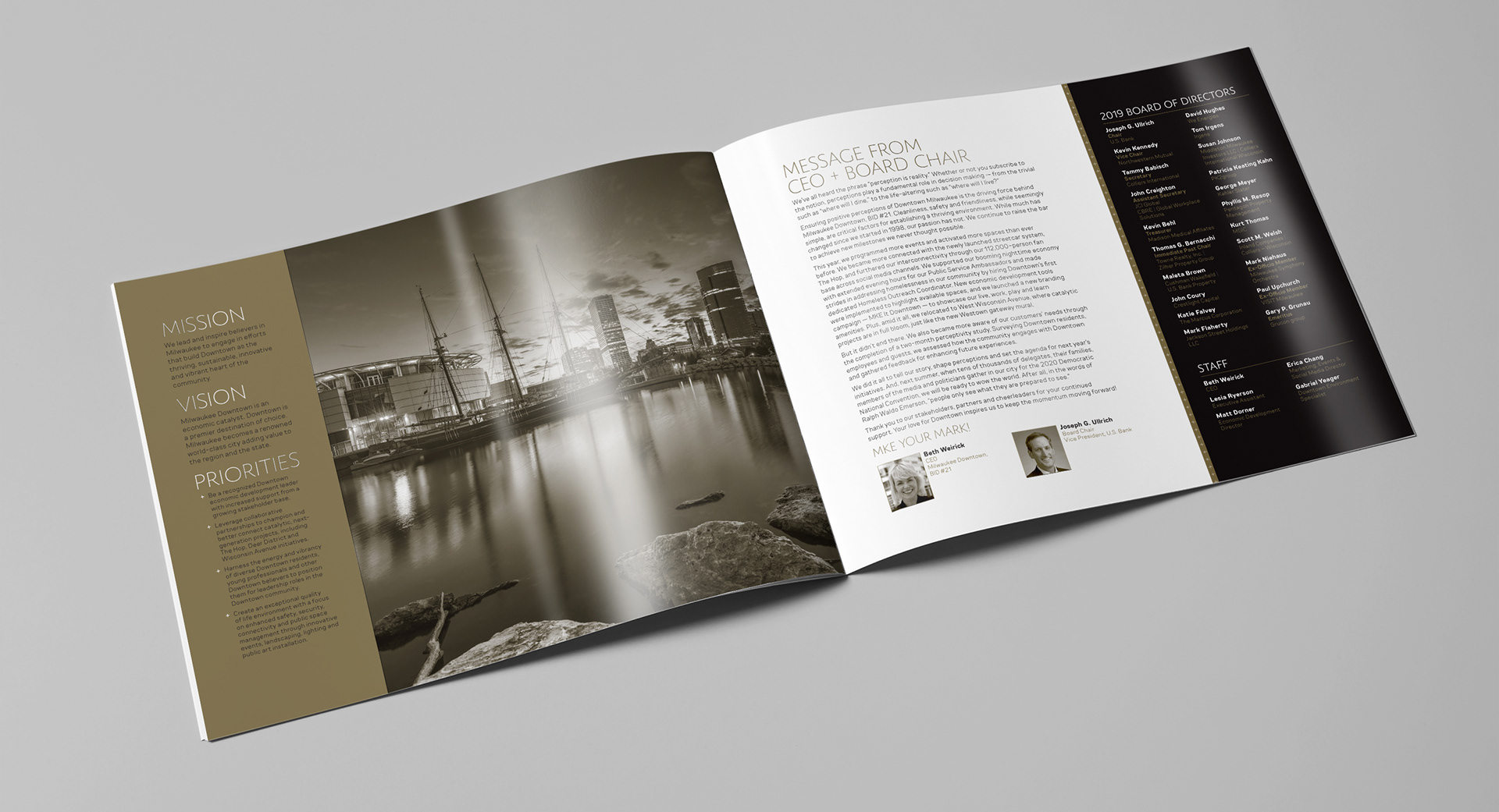

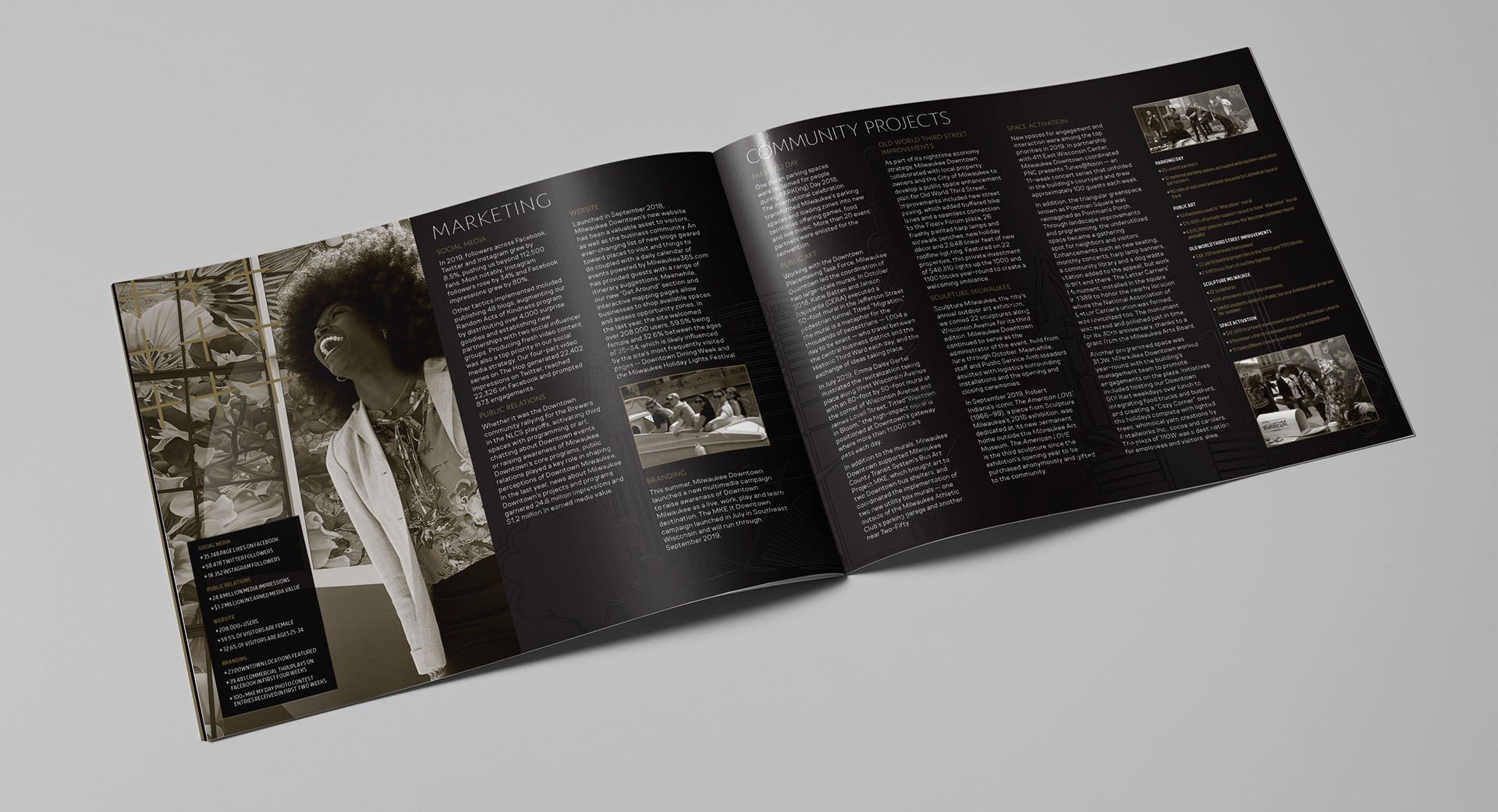
You can see the subtleness of the varnish on this spread above over the four columns of white text across the spread.
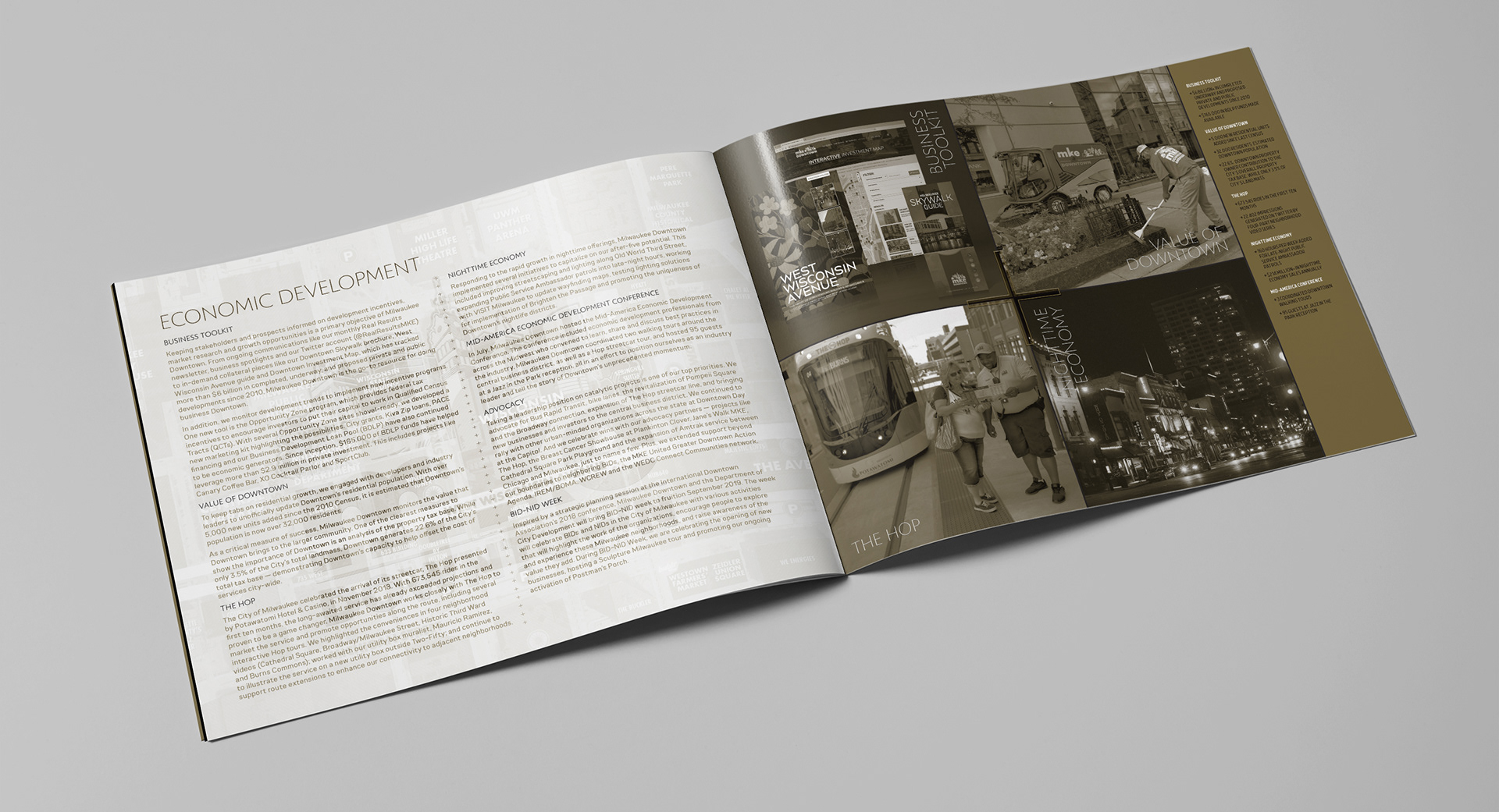
The varnish changed the values on the page depending on ambient lighting without affecting legibility.